A little pen and ink at Epcot...

Tim

Administrator
Staff member
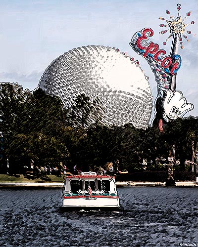
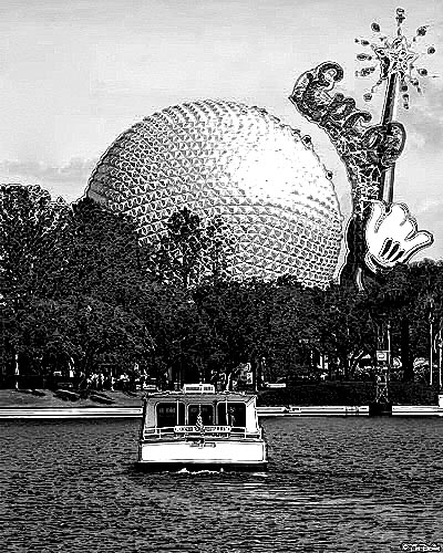
I don't usually mess with this stuff too much but I am starting to like this look. Whatcha think?

[This attachment has been purged. Older attachments are purged from time to time to conserve disk space. Please feel free to repost your image.]
 
Last edited by a moderator:
my .02 worth
it works for the trees,land and sse,
but not for the boat and water, can this be done with a brush and mask leaving the water and friendship as original?
or else intensify the look for the water, go for the almost smeared watercolor effect
 
Agree with Gary about the Friendship there.

What the heck is that garish thing over SE?
 
It kind of reminds me of a picture from the 70's. Maybe it's the color of the tree's. I like sse and the slight texture in the sky.
 
Last edited by a moderator:
For some reason it hurts my eyes when I look at it. I think it might be due to the treatment. But I agree, it does look like it's aged or something
 
Last edited by a moderator:
I won't go so far as to say it's the graphical equivalent of Beverly, but it's not my cup of tea. I agree with Gary though - I think I'd like it more if the boat and trailing water were masked, so they appeared "normal".

Maybe it's time for a Photoshop Challenge - release a good sized original and see who can come up with the best "version" !
 
Last edited by a moderator:
Okay, as a joke....someone tell nrose101 to come see.


[This attachment has been purged. Older attachments are purged from time to time to conserve disk space. Please feel free to repost your image.]
 
I prefer the pen and ink look myself:

epcot-color_ink.jpg
epcot-bw_ink.jpg


Gotta love all those many and varied filters that come built-in with Photoshop CS2.
 
Back
Top