"Scottwdw" said:
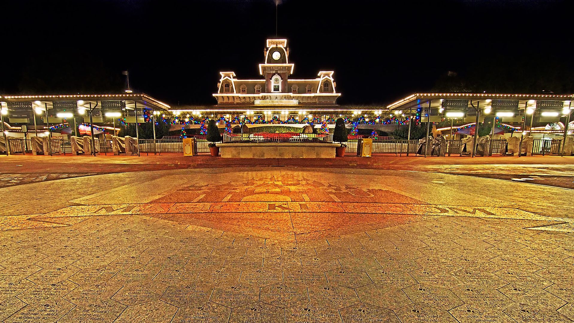
Thanks, Tom. ; Did you do something to the castle logo? ; Looks like it's been highlighted more than just turning up the exposure. ;
My challenge is to see if I can replicate this look in the tools I own. ; Really appreciate you and Craig for helping out!
I really wish I could get the image to display at 50% size here; it looks much better on my screen. ; Here, a lot of the lines look jagged for some reason (if you want a copy of the file, I can email it to you).
I really wish Photoshop had a way to export steps into text. ; That would make this so easy. ; Here is roughly what I did.
1. ; Converted image to Smart Object and drastically increased shadows (+30 or so) while slightly increased highlights and midtone contrast (masked out sky so it retained original color).
2. ; Used adjustment layer to dramatically increase contrast and brightness (+50 and +25, respectively) in lower 50% of image (masked out top half).
3. ; Used adjustment layer to dramatically increase contrast and slightly increase brightness (+35 and +10, respectively) in lower 50% of image (masked out top half).
4. ; Used adjustment layer to dramatically increase contrast and brightness (+50 and +25, respectively) in Magic Kingdom logo (masked out rest).
5. Used adjustment layer to increase gamma throughout.
6. Used burn tool to decrease exposure on one part of MK logo, MK Train Station sign, and clock.
7. Used adjustment layer to increase saturation slightly.
8. Sharpened using LAB sharp/feather/USM Action preset.
9. Found center point and cropped at (rough) center.
In retrospect (after looking at the other images), it would have likely looked better with less contrast in the center lower portion of the image. ; Oh well.